AI App Design Examples: How to Make AI-Built Apps Look Like Real Products
Study AI app design examples that show how founders can turn generic AI-built screens into polished product flows with layout, states, copy, and motion-ready UI direction.
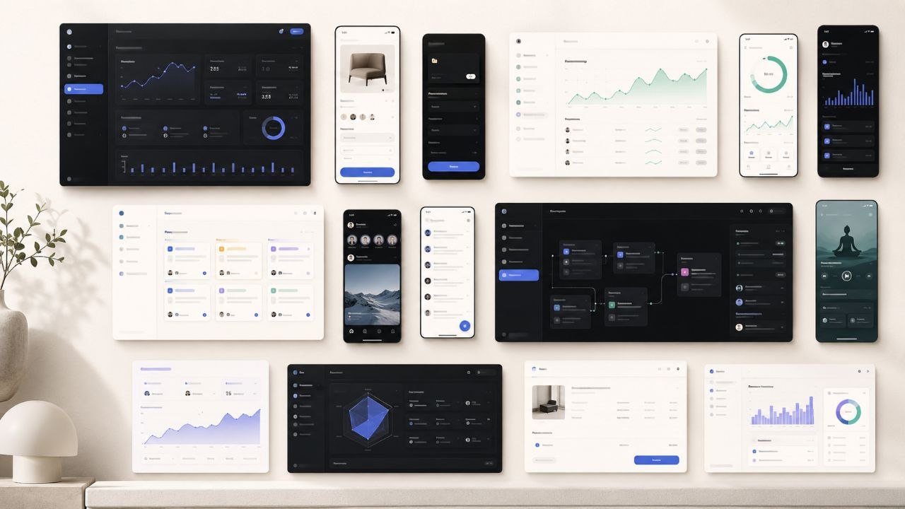
AI app builders can generate screens quickly, but speed is not the same thing as product quality. The weak output usually looks familiar: centered hero, rounded cards, gradient blob, fake dashboard chart, and copy that could belong to any SaaS product. What founders actually need are AI app design examples that show how a real interface behaves across flows, states, categories, and user intent.
The best examples are not just pretty screenshots. They give you a product direction you can reuse: the density of a finance app, the trust cues of a health product, the booking flow of a hospitality site, the onboarding logic of a productivity tool, or the premium merchandising system of ecommerce. A curated UI library like v-1.design helps you study those patterns before you ask an AI builder to produce the next version of your app.
Key Takeaways
- Strong AI app design examples show full product thinking, not isolated hero screens.
- Generic AI UI usually fails because the prompt lacks category, flow, state, copy, and visual hierarchy constraints.
- Founders should reference examples by product type: SaaS, ecommerce, finance, health, productivity, marketplace, social, or mobile utility.
- The most useful design examples include edge states: empty, loading, success, error, upgrade, checkout, and onboarding.
- v-1.design gives builders a practical reference library for turning AI-generated app ideas into more credible product interfaces.
Why AI App Design Examples Matter
AI app builders are good at assembling a plausible first pass. They are much weaker at knowing what your product category should feel like. A wedding booking tool, developer analytics dashboard, luxury wine storefront, social fitness app, and family health tracker should not share the same visual rhythm.
That is where examples become leverage. Instead of prompting from taste words like “modern,” “clean,” or “premium,” you can prompt from product evidence: “use a dense finance dashboard layout,” “borrow the calm onboarding cadence of a health app,” or “use editorial ecommerce merchandising with large product imagery and restrained checkout UI.”
Examples turn vague taste into usable direction
A vague prompt asks AI to invent the entire product language. A referenced example narrows the decision space. It tells the model what kind of spacing, contrast, navigation, component density, and emotional tone belongs in the product.
Examples also prevent category drift
Many AI-built apps drift into generic SaaS because generic SaaS is the average of the training data. Category-specific examples pull the output back toward the market you actually serve.
What Good AI App Design Examples Show
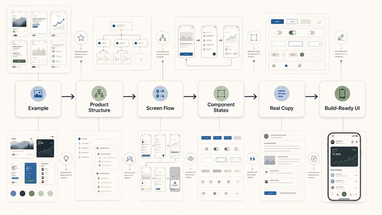
A useful AI app design example should answer four questions: what does this product do, who is it for, what state is the user in, and what action should happen next? If an example only shows a beautiful static screen, it is inspiration. If it shows the product logic behind the screen, it becomes a reusable design reference.
1. Product structure
Good examples reveal the shape of the product: dashboard, feed, marketplace, checkout, booking flow, editor, timeline, CRM, onboarding, or reporting workspace. This structure matters more than surface styling because AI builders need to understand what components belong on each screen.
2. Visual hierarchy
Strong examples make the next action obvious. They distinguish primary information from secondary context, use spacing to create priority, and avoid filling every card with equal visual weight.
3. Real product copy
Bad AI UI uses placeholder copy: “Track your progress,” “Manage your workflow,” “Unlock insights.” Good examples use product-specific language: appointment holds, allocation windows, claim deadlines, lease renewals, onboarding tasks, review queues, credit utilization, or route planning.
4. Interaction-ready detail
A real app needs more than a default screen. It needs hover states, disabled states, empty states, loading indicators, success messages, errors, filters, tabs, modals, confirmations, and upgrade prompts.
AI App Design Example Categories to Study
The right example depends on the product you are building. v-1.design already has hundreds of curated product directions across categories like ecommerce, SaaS, productivity, AI, health, finance, social, fitness, games, wellness, travel, and developer tools. That range matters because each category has a different trust problem.
SaaS and productivity examples
Study these when your app needs dashboards, project views, collaboration surfaces, settings, permissions, reports, or repeat workflows. The design should make ongoing work feel controlled, not decorative.
Look for:
- Clear navigation between workspace areas
- High-density cards without clutter
- Fast scanning for status, owner, deadline, and next action
- Useful empty states that teach the workflow
Ecommerce and marketplace examples
Use these when your product sells items, bookings, subscriptions, tickets, memberships, allocations, or services. The interface must balance desire, trust, and transaction clarity.
Look for:
- Merchandising systems, not just product grids
- Checkout steps that feel secure and short
- Product detail pages with proof, scarcity, and comparison context
- Mobile-first purchase paths
Finance and health examples
These categories require restraint. Overly playful UI can reduce trust. Good examples use calm hierarchy, clear data labels, predictable navigation, and careful use of color.
Look for:
- Readable metrics and chart labels
- Trust-building summaries before detailed data
- Privacy and security cues placed near sensitive actions
- Error and confirmation states that reduce anxiety
Social, fitness, and consumer mobile examples
Consumer apps need momentum. The UI should create a reason to return: streaks, feeds, profiles, challenges, reminders, progress, saved collections, or lightweight creation flows.
Look for:
- Habit loops built into the interface
- Fast onboarding with low cognitive load
- Profile, feed, and notification patterns that feel native
- Visual energy without unreadable clutter
How to Prompt AI Builders From Design Examples
A strong prompt should tell the AI builder what to preserve, what to change, and what to avoid. If you only paste a screenshot and say “make it like this,” you will usually get a surface-level imitation. Better prompts translate the example into product rules.
A practical prompt structure
Use this structure when moving from examples to an AI builder:
- Product context: what the app does and who uses it.
- Reference category: the type of example you want to borrow from.
- Screen list: the exact screens or routes to generate.
- Component requirements: cards, nav, filters, forms, tables, modals, charts, or checkout.
- States: empty, loading, success, error, disabled, upgrade, onboarding.
- Copy rules: real labels and product-specific microcopy, no lorem ipsum.
- Visual constraints: density, palette, typography feel, image style, motion direction.
Example prompt
Design a mobile-first booking app for independent fitness coaches. Use the structure of a premium scheduling and client-management product, not a generic SaaS dashboard. Create onboarding, weekly calendar, client profile, package checkout, session confirmation, and cancellation states. Use concise product copy with real labels: session credits, coach availability, reschedule window, package renewal, client notes. Keep the interface energetic but trustworthy, with strong hierarchy, clear CTAs, and native mobile patterns. Include empty, loading, error, and success states for the booking flow.
The States and Flows Most Examples Miss
Most AI app design examples stop too early. They show the ideal state: a full dashboard, perfect data, happy path, clean chart, and one obvious CTA. Real products live in the messy states.
Empty states
Empty states should teach the user what to do next. A blank dashboard that says “No data yet” is a missed conversion moment. A better empty state explains the first action, why it matters, and what the user will see afterward.
Loading states
Loading states set perceived speed. Skeleton cards, progress labels, and short messages make the product feel more intentional than a spinner in the center of the page.
Error states
Error states are trust moments. Good examples tell the user what happened, what they can do, and whether their work is safe.
Upgrade states
Upgrade prompts should appear where value is visible. If the product blocks a feature too early, the user feels trapped. If it waits until the user understands the benefit, the paywall feels like a natural next step.
Using v-1.design as Your AI UI Reference Library
v-1.design is useful because it gives founders and builders a broad set of product interface directions before they generate or rebuild their own app. Instead of starting from a blank prompt, you can browse a category, identify a stronger product pattern, and translate that pattern into your AI builder prompt.
Use the v-1.design library when you need a sharper visual direction for a new product, a better prompt for an AI app builder, or a category-specific reference before handing the design to development.
If you are turning a reference into an app, start with the guide to moving from library to app. It helps you use the design direction as a practical build input, not just a moodboard.
A simple workflow
- Pick the product category closest to your app.
- Choose one example for structure and one example for visual tone.
- Write down the routes, components, states, and copy patterns you want preserved.
- Prompt your AI builder with those rules instead of generic adjectives.
- Review the output against the example: hierarchy, category fit, state coverage, and product specificity.
The goal is not to copy a screen. The goal is to stop AI from averaging your product into the same generic layout everyone else ships.
FAQ
What are AI app design examples?
AI app design examples are reference interfaces that help founders, designers, and builders guide AI-generated app output. The best examples show product structure, visual hierarchy, real copy, states, and flows — not just a static homepage or dashboard screenshot.
Why do AI-built apps look generic?
AI-built apps often look generic because the prompt is too broad. Words like “modern,” “clean,” and “premium” do not define category, navigation, component density, user state, or product copy. Specific examples give the AI builder stronger constraints.
How should I use app design examples in prompts?
Use examples to describe what the AI should preserve: layout structure, category feel, route list, component behavior, visual hierarchy, and state coverage. Avoid asking for a direct copy. Translate the example into design rules for your own product.
What app states should I ask AI builders to design?
Ask for empty, loading, success, error, disabled, upgrade, onboarding, confirmation, and edge-case states. These are the states that make an app feel real instead of like a static screenshot.
Can v-1.design help with Lovable, Bolt, Replit, or Cursor builds?
Yes. v-1.design can be used as a visual and structural reference before prompting AI app builders or coding agents. Browse the library, pick a category-specific direction, then convert that direction into routes, components, states, and copy requirements.
Find stronger AI app design examples in v-1.design
Browse the v-1.design library to find AI app design examples by category, visual style, surface, and product type. Use the examples to write better prompts, avoid generic AI UI, and give your next app a product direction that feels intentional from the first screen.