Why AI-Built Apps Look the Same: 7 Generic UI Patterns
Why do AI-built apps look generic? Diagnose seven recurring UI patterns, from placeholder content and flat hierarchy to missing states and acceptance checks.
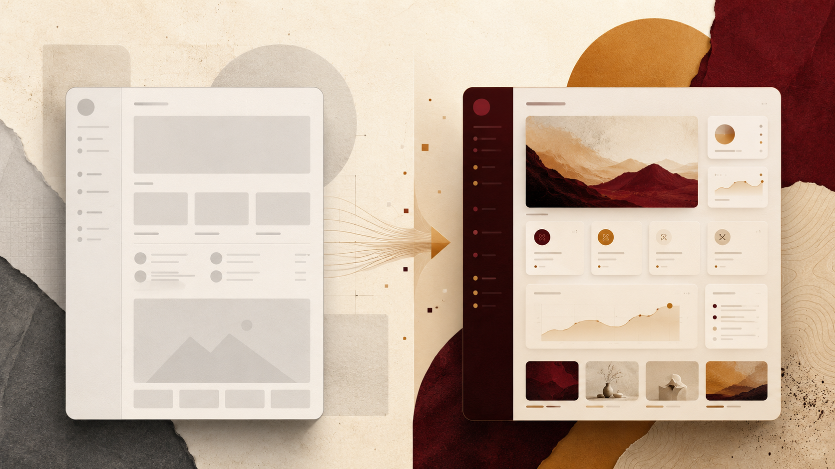
AI-built interfaces can converge on the same visual language even when the products are unrelated. Rounded cards, familiar sidebars, interchangeable dashboard charts, vague labels, and a bright accent on a neutral canvas are not necessarily model failures. They can be signs that the design brief left important decisions open.
A generic result can still be clean and functional. The problem is that it does not communicate why this product, user, or workflow is different. This guide is the diagnosis: seven patterns that make AI-built apps feel interchangeable, how to spot them, and when the issue is the brief rather than the tool.
Key Takeaways
- Generic AI UI can begin with an underspecified product job, not a missing CSS trick.
- Placeholder content hides the hierarchy and density problems that real labels, numbers, and edge cases expose.
- A polished component library cannot supply a product-specific point of view on its own.
- Missing states, responsive rules, and acceptance criteria make a screenshot look finished while leaving the actual interface unresolved.
- Diagnose which decision is missing before changing tools or rewriting the whole design.
- For the full seven-decision framework, copyable template, and worked examples, use our AI design prompts guide.
What generic AI UI looks like
Generic AI UI is less about one color or component and more about weak correspondence between the interface and the product. The page may have a competent header, sidebar, cards, chart, and call to action, yet none of those choices reveal who uses the product, what decision matters, or what makes the workflow consequential.
Look for substitution tests. Could the same dashboard become a CRM, analytics tool, content planner, or finance app by changing only the nouns? Could every card move to another page without changing the hierarchy? Does the empty state say only “No data yet”? If the interface survives those substitutions unchanged, the visual system may be describing a software category rather than this product.
The pattern is easy to see in first-pass dashboards because component libraries make familiar arrangements easy to assemble. It can also appear in landing pages, mobile apps, onboarding flows, and settings screens. The surface changes; the underlying issue is the same: the builder had to invent decisions that the brief did not settle.
Seven reasons AI-built apps converge
1. The job is described as a category
“Build a SaaS dashboard” names a page type. It does not identify the person, moment, or decision the screen exists to support. A customer-success manager triaging at-risk accounts, a founder approving growth assets, and a finance lead investigating a variance may all use dashboards, but they need different density, hierarchy, and interaction weight.
When the job remains generic, the interface has no reason to privilege one element over another. The result can become a balanced arrangement of equally important cards rather than a composition shaped by a real task.
2. The content is placeholder-shaped
Lorem ipsum, “Metric 1,” “Recent activity,” and neat two-word labels make almost any layout look stable. Real content introduces long names, uneven numbers, warnings, permissions, missing values, and actions with different consequences. Those details determine column width, wrapping, emphasis, and whether a card or table is appropriate.
An interface designed around filler can look polished in a screenshot and become generic or fragile the moment real data arrives. This is why content is part of the design system, not something added after the design is complete.
3. The composition has no declared priority
If the brief does not say what should dominate the viewport, the builder still has to choose. One possible fallback is a centered headline followed by an even grid of cards. That composition is not inherently bad, but it becomes generic when used without regard for the workflow.
Operational products may need a dense table, queue, timeline, canvas, map, or split comparison to own the page. A composition should reveal what the user does most, not merely distribute components evenly.
4. The visual tokens have values but no rules
Naming a blue, a gray, and a font is not the same as defining a visual system. The interface also needs usage rules: which color marks risk, which typeface carries numbers, how much radius belongs to interactive surfaces, and where contrast must increase.
Without those roles, the accent can appear everywhere, every card can receive the same treatment, and typography can flatten into one neutral scale. The page may be consistent while still lacking a recognizable point of view.
5. Only the happy path was designed
Loading, empty, error, permission, hover, focus, disabled, long-title, and mobile states expose whether the interface has been designed as a product or only as a still image. Missing states encourage generic fallback components because the builder has no product-specific behavior to preserve.
The same is true for motion. An unspecified transition can become decorative animation; an unspecified reduced-motion behavior can disappear entirely. States and motion are not polish added after the main screen. They are part of the screen’s meaning.
6. The reference is visual but not operational
A screenshot can communicate taste, but it does not explain what the components do, how spacing changes on mobile, which content is real, or what happens when the data fails. A reference without accompanying tokens and behavior rules can lead to surface imitation rather than a coherent rebuild.
Useful references make decisions inspectable. They connect the visible interface to fonts, colors, spacing, components, states, and responsive behavior. That gives the builder more than a mood to approximate.
7. There is no acceptance test
“Make it look premium” cannot be verified. “At 1440px, show at least 14 account rows without scrolling” can. So can “the only red on the page marks risk,” “every row action is keyboard reachable,” or “the mobile view keeps the account name and health visible.”
Without acceptance criteria, review returns to taste words and broad restyling. The interface may improve, but nobody can say precisely which design decision passed or failed.
Why polish does not create a point of view
Polish can make a generic interface more pleasant without making it more specific. Better shadows, gradients, icons, and animation do not answer what the user should notice first or why this screen is different from another product in the same category.
A point of view appears when visual decisions correspond to product decisions. A risk screen reserves urgency for risk. A writing app used before sleep avoids stimulating feedback. A founder approval queue makes blocked and irreversible actions visibly different from routine edits. Those are not decorative preferences; they are product logic expressed visually.
This also explains why switching AI tools may reproduce the same problem. Different builders have different capabilities and defaults, but an empty brief still leaves each tool to infer audience, hierarchy, density, and states. Changing the model can change the surface while preserving the underlying ambiguity.
A diagnostic checklist before changing tools
Before rewriting the entire interface, inspect the current output with these questions:
- Can you name the exact user, moment, and decision this screen supports?
- Does the viewport have one clearly dominant element tied to that decision?
- Is the content realistic enough to test wrapping, density, hierarchy, and empty states?
- Do colors, typography, spacing, and radius have usage rules rather than isolated values?
- Are loading, empty, error, permission, focus, and mobile states defined?
- Does the reference include system details, or only a screenshot?
- Can each important design choice be reviewed with a pass/fail check?
A “no” identifies a missing decision. It does not automatically mean the whole design is bad or the builder is incapable. Diagnose the gap first; then change the smallest relevant part.
Where prompt construction begins
Once the missing decisions are clear, the next step is not another adjective stack. It is a compact brief that names the user and job, screen and content, visual direction, type and color rules, composition, component states, guardrails, and acceptance checks.
That full solution now has one canonical owner: AI Design Prompts: A Framework, Template, and 3 Examples. It includes the seven-decision framework, a master template, three complete prompts, a scoped iteration method, tool-specific handoff notes, and FAQ guidance. This page stays focused on diagnosis so the two guides answer different search intents.
Where finished references help
A finished reference can reduce the number of visual decisions you have to invent from scratch. The useful version is not only an image: it connects a live interface to the design-system values, assets, and rebuild instructions that expose how the design works.
The v-1.design Library packages four parts together: live demo, design system, assets, and rebuild prompts. If you want to understand the handoff before choosing a design, the Library guide explains how to carry literal fonts, colors, spacing, states, and acceptance checks into an AI builder while using the live demo as the comparison target.
FAQ
Why do AI-built apps often look the same?
They can converge when the brief names a software category but leaves the user, job, content, composition, visual rules, states, and acceptance criteria open. The builder then supplies familiar defaults that may be competent but not product-specific.
Is generic AI UI a limitation of the coding model?
Not necessarily. Models and tools have different capabilities and defaults, but a visually generic result can also come from an underspecified brief. Diagnose the missing decisions before assuming the tool itself is the only cause.
How can I tell whether a design brief is underspecified?
Try the substitution test: if the interface could become a CRM, analytics app, or content tool by changing only the nouns, the design may describe a category rather than the product. Also check for placeholder content, equal-weight cards, missing states, and acceptance criteria that cannot be measured.
Will adding more visual adjectives fix generic AI UI?
Adjectives can set a mood, but they do not define fonts, color roles, density, composition, states, or responsive behavior. They become useful when anchored to concrete decisions and references.
Where can I find a complete AI design prompt template?
The v-1.design AI design prompts guide contains a seven-decision framework, one copyable master template, three complete examples, and a method for making scoped revisions without restyling the entire interface.
Diagnose first, then choose a direction
A generic first pass is useful evidence. It shows which decisions the brief left unresolved. Name those gaps before changing the whole toolchain or asking for a broad redesign.
When you are ready to write the brief, use the complete AI design prompt framework. If you would rather start from an inspectable visual system, browse the v-1.design Library and choose a reference whose decisions fit the product you are building.