Lovable Design Prompts That Stop Generic AI UI
Learn how to write Lovable design prompts that preserve visual direction, routes, component states, and real product copy instead of producing generic SaaS UI.
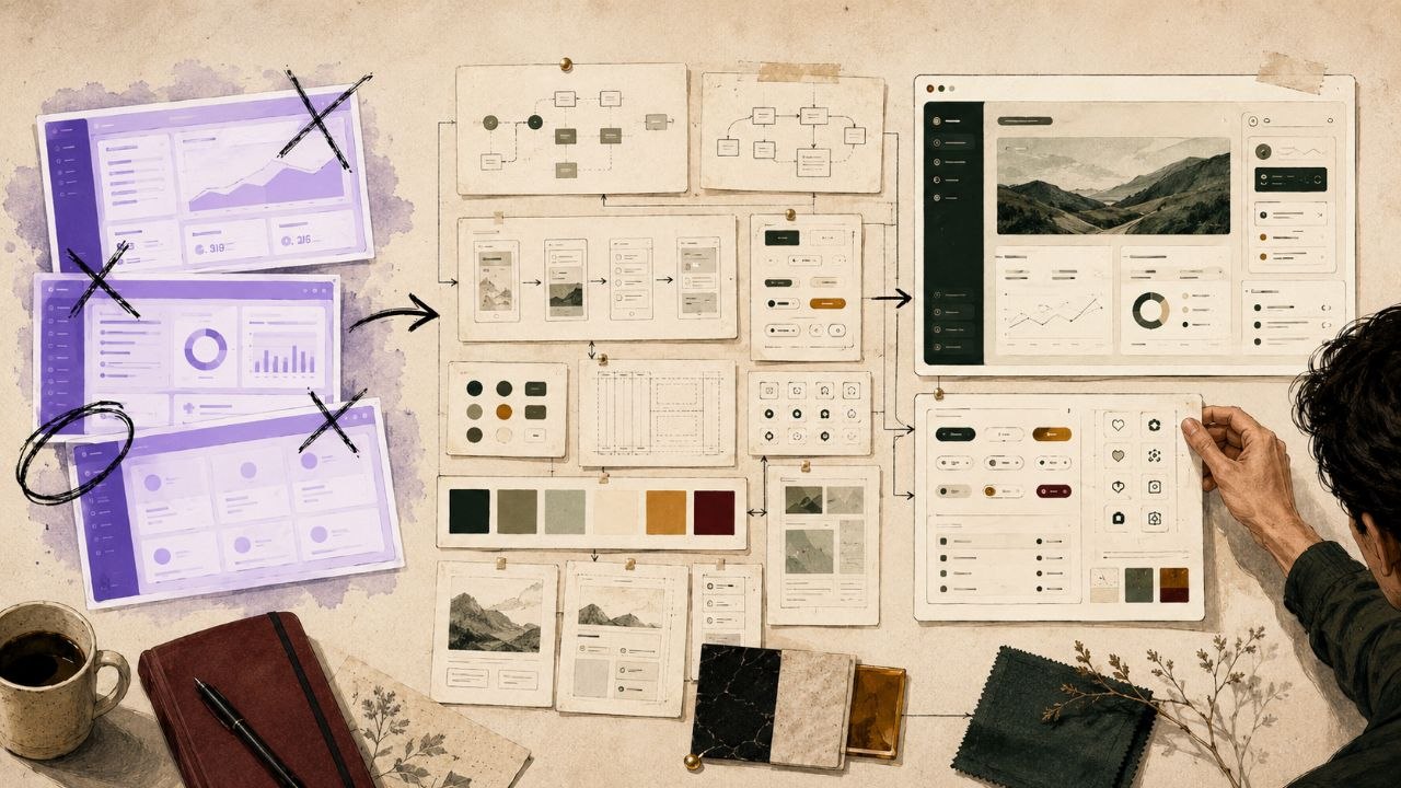
Lovable can turn a product idea into a working app at serious speed. That is the advantage. You describe the workflow, refine the build, and move closer to a shippable product without starting from a blank canvas.
The visual problem starts when Lovable is asked to invent taste from a thin prompt. “Make it modern” gives the builder almost nothing to preserve. The result is familiar: rounded cards, soft gradients, fake metrics, generic sidebars, and pages that look finished in isolation but feel like every other AI-built SaaS product.
Key Takeaways
- Lovable is strongest when it receives a design source, not just a product description.
- A useful prompt defines routes, states, real copy, density, navigation, and responsive behavior before generation starts.
- The goal is not to make one screen attractive. The goal is to preserve the same visual system across the full app.
- v-1.design can act as the taste layer before Lovable by giving the builder a finished interface direction to translate.
- Better prompts reduce generic AI UI by replacing vague style adjectives with concrete product and design rules.
Why Lovable Apps Look Generic
Generic Lovable output usually comes from an underspecified brief. The prompt names the app category but skips the design system. Lovable knows the product needs a dashboard, settings page, onboarding flow, or pricing route. It does not know what should feel dense, what should feel premium, what should stay consistent, or how real users will move between pages.
That missing context forces the model toward defaults. It fills the gap with patterns it has seen everywhere: glassy cards, purple gradients, abstract charts, placeholder testimonials, and broad CTA copy. The interface looks complete, but the product language is weak.
The prompt is doing too many jobs at once
A single vague instruction asks Lovable to solve product strategy, UX hierarchy, visual direction, content, and responsive behavior in one pass. That is too much hidden work. The fix is to separate the design source from the build instruction.
The Design Source Lovable Needs
A design source gives Lovable something specific to preserve. It can be a v-1.design library item, a rebuild prompt, a design-system description, or a clear visual reference translated into rules. The important part is that the source explains the design language before Lovable starts creating pages.
The design source should define the parts that usually drift: typography, spacing, density, card treatment, navigation, mobile behavior, state language, and the amount of visual noise allowed on each page.
Design direction should travel across routes
A homepage, dashboard, item detail page, settings page, and upgrade screen should feel like the same product. Screens that look unrelated create the “AI-generated app” feeling even when each screen is individually attractive.
The Lovable Design Prompt Framework
A strong Lovable design prompt contains seven layers. Each layer removes a place where the model would otherwise guess.
- Product job — what the app helps the user accomplish.
- Audience — who uses it and what they care about.
- Design source — the visual direction to preserve.
- Routes — every page the app needs.
- States — empty, loading, locked, error, success, and mobile.
- Real copy and data — actual labels, item names, numbers, and statuses.
- Do-not-change rules — what Lovable must not simplify into generic UI.
Build a [product type] for [audience].

Use this design source:
[paste the v-1.design rebuild prompt or summarize the selected design direction]

Preserve across every page:
- typography: [specific style]
- spacing and density: [specific rules]
- colors: [specific palette]
- cards: [shape, border, shadow, texture]
- navigation: [top nav, sidebar, tabs, command bar]
- mobile behavior: [stacking, sticky actions, readable cards]

Create these routes:
- /dashboard — [purpose]
- /items — [purpose]
- /items/[id] — [purpose]
- /settings — [purpose]
- /upgrade — [purpose]

Include these states:
- empty
- loading
- error
- locked/free-plan
- success
- mobile

Do not replace the design source with a generic SaaS dashboard.
A Better Lovable Prompt Example
Weak prompt: “Build a growth dashboard for reviewing marketing tasks.”
Better prompt: “Build a founder approval dashboard for reviewing v-1.design growth tasks. Use a dark editorial design source with cream review cards, compact mono labels, green approval states, and a strict hierarchy where actionable drafts appear first. Include sections for blog articles, TikTok scripts, Reddit leads, directories, Postiz posts, and product tasks. Each item needs a review packet, impact score, source links, approval state, and after-approval action. Preserve the same card language and approval interactions across every route. Do not turn this into a generic analytics dashboard.”
The better prompt names the actual decision the user is making. It also tells Lovable which visual and workflow details matter. That is the difference between a dashboard-shaped page and a product interface.
Common Lovable Prompt Mistakes
Mistake 1: Style adjectives without rules
Modern, clean, and premium are too broad. Replace them with specific rules for type, density, color, layout, and motion.
Mistake 2: One good screen instead of a system
A strong first screen is not enough. Lovable needs the shared rules that make dashboard, detail, settings, and upgrade pages feel connected.
Mistake 3: Fake data
Fake metrics produce fake interfaces. Real labels, statuses, and examples tell Lovable what the product actually needs to prioritize.
Mistake 4: Skipping states
Empty, loading, error, and locked states are where AI-built products often feel unfinished. Include them in the initial prompt instead of patching them later.
Use v-1.design Before the Lovable Build
Use the v-1.design library as the design source before the Lovable build step. Pick a finished direction, copy the rebuild prompt, and adapt it with your real routes, copy, product data, and states.
If you are moving from library inspiration into an app builder, the Library to app guide explains the workflow. If your app already looks too generic, read why AI-built apps look the same before writing another vague prompt.
Frequently Asked Questions
What are Lovable design prompts?
Lovable design prompts are product and design instructions that guide Lovable’s visual output. A strong prompt includes a design source, route map, component states, real copy, responsive rules, and constraints so the generated app keeps a coherent product direction.
How do I make my Lovable app look less AI-generated?
Start with a finished design direction, then tell Lovable exactly what to preserve: typography, spacing, density, navigation, mobile behavior, states, and real product labels. Do not rely on vague words like modern, clean, or premium.
Can I use v-1.design with Lovable?
Yes. Use v-1.design as the design source layer before the Lovable build step. Choose a finished direction from the library, bring the rebuild prompt into Lovable, then add your product routes, copy, data, and interaction states.
Should I prompt Lovable one screen at a time?
For a serious app, start with the whole product system. Define shared visual rules, routes, states, and navigation first. You can refine individual screens later, but the first prompt should establish continuity.