Why Screenshots Alone Won’t Make Your App Feel Alive
Static screenshots can show layout, but they miss micro-interactions, page-to-page continuity, premium motion, and the discovery work needed to make an app feel real.
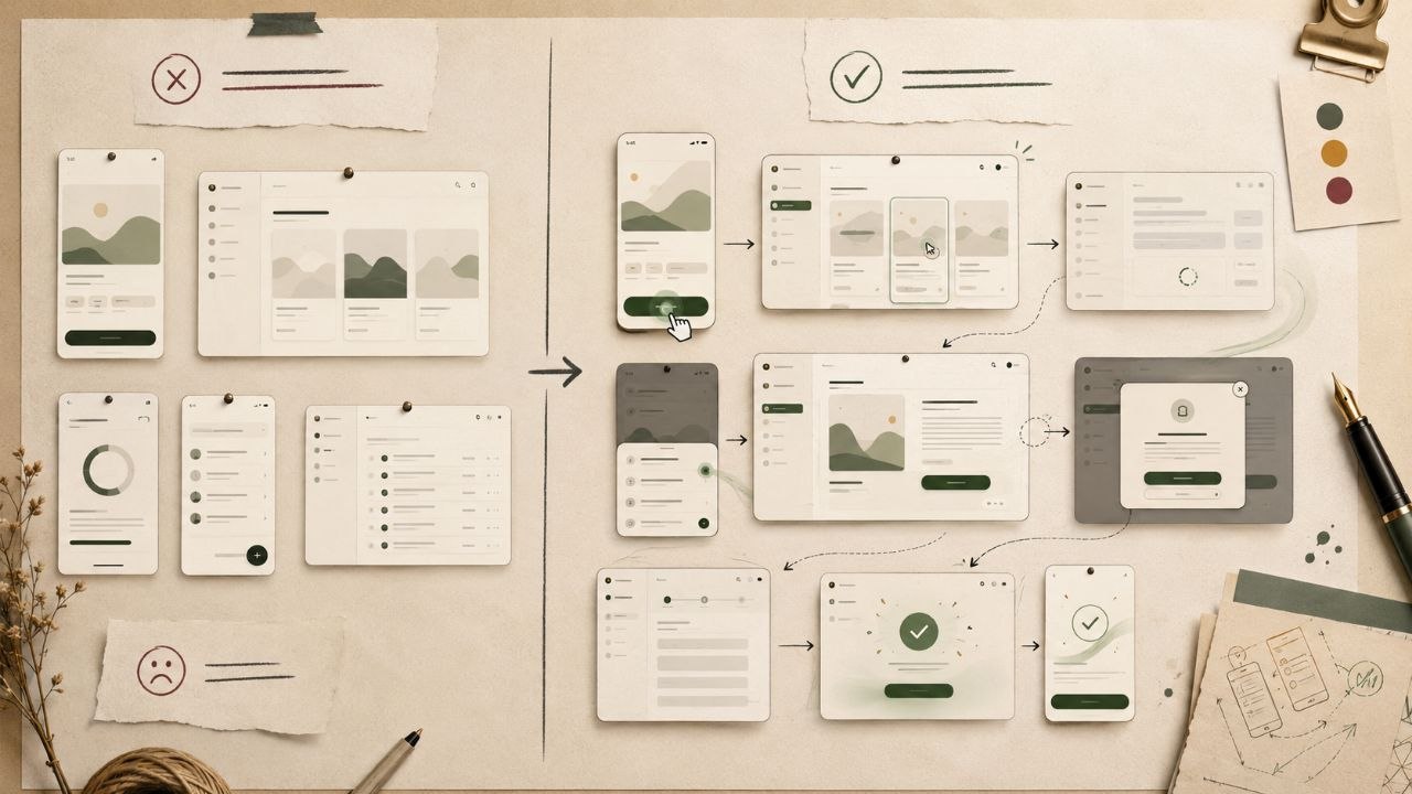
A screenshot can show what an app looks like at one moment. It cannot show what the app feels like when someone clicks, waits, edits, saves, navigates, fails, recovers, or returns to the same object later.
That gap is why many AI-built products look acceptable in a single generated frame but feel flat once you move through them. The layout is there. The cards are there. The hero section is there. What is missing is the interaction layer: the small responses and continuity rules that make software feel premium.
Key Takeaways
- Screenshots are useful for visual direction, but they do not capture behavior.
- Premium product feel comes from micro-interactions, feedback, loading states, and continuity between routes.
- A page can look polished in isolation and still feel cheap when the user clicks through the product.
- AI builders often copy the static composition while missing the state and motion decisions behind it.
- Better prompts specify interaction rules, transition logic, empty states, and page-to-page continuity.
Screenshots Capture Layout, Not Product Feel
Screenshots are good at capturing the visible layer: typography, spacing, color, hierarchy, content density, card treatment, and overall mood. That is valuable. A strong screenshot can communicate whether the product should feel editorial, technical, playful, luxury, dense, or minimal.
The problem starts when screenshots are treated as the complete product design. They freeze one state of the interface. They do not explain what happens before the screen, after the screen, or during the action that changes the screen.
A still image cannot show intent
It cannot show whether a click registered, whether an item is selected, whether the system is working, whether the user can undo an action, or why a control is disabled. Those are product questions, not screenshot questions.
The Interaction Layer Screenshots Miss
The interaction layer is the set of small behaviors that sit between static screens. It includes hover states, pressed states, focus states, loading skeletons, inline validation, success feedback, error recovery, empty states, disabled explanations, mobile gestures, scroll behavior, and page transitions.
These details look small. They are not. Together, they create the feeling that someone has actually used the product, found the awkward moments, and designed the responses.
Why Micro-Interactions Make Software Feel Premium
Micro-interactions are feedback loops. They tell the user that the interface heard them. A pressed button, selected card, loading skeleton, inline success state, or contextual error message closes the gap between intent and response.
Cheap-feeling software usually fails in these moments. Buttons jump to the next page with no feedback. Loading flashes unpredictably. Modals appear without context. Success messages feel disconnected from the action. The product technically works, but it does not feel cared for.
Premium means the system explains itself
Premium UI does not need excessive animation. It needs the right feedback at the right moment. The user should always understand what changed, why it changed, and what they can do next.
Why Page-to-Page Continuity Is Hard
The hardest part is not making one screen attractive. The hard part is making every route feel like the same product. A dashboard screenshot does not explain how the detail page should behave. A detail page screenshot does not explain how filters persist. A settings screenshot does not explain what happens after the user saves changes.
Continuity requires rules: which actions stay global, which objects persist across routes, how status language repeats, how mobile navigation compresses, how empty states teach the next step, and how motion connects one page to another.
Disconnected pages create the AI-template feeling
An AI builder can generate five individually decent pages that still feel unrelated. The user senses the mismatch immediately. It feels like a stack of templates, not a product.
The Discovery Work Hidden Behind Premium UI
Premium product feel usually comes from discovery work that is invisible in the screenshot. Someone had to click through the flow, test real content, break empty states, notice awkward transitions, decide what persists, and tune which actions deserve emphasis.
That is why screenshot-to-app work is harder than it looks. You can copy surface motifs from page to page, but the feeling lives in the connective tissue between screens.
Prompt the Behavior, Not Just the Picture
If you want an AI builder to create an app that feels alive, prompt the behavior. Do not stop at visual direction. Add the interaction rules that define how the product responds.
Build [product/app] using this visual direction:
[paste design source or screenshot-based visual rules]

Preserve the static design:
- typography
- spacing
- colors
- card style
- navigation
- content density

Add interaction rules:
- buttons show pressed and loading states
- selected cards visibly change state
- forms show inline validation and success feedback
- loading states use skeletons that match the final layout
- disabled actions explain why they are disabled
- page transitions preserve context

Add continuity rules:
- keep navigation and primary actions consistent across pages
- preserve object identity from list view to detail view
- reuse the same status language everywhere
- keep mobile actions reachable with sticky controls

Do not create disconnected pages that feel like unrelated templates.
Use the v-1.design library for the visual source, then layer interaction rules on top before moving into an AI builder. For the build workflow, see Library to app. For the broader visual problem, read why AI-built apps look the same.
Frequently Asked Questions
Are screenshots bad for app design?
No. Screenshots are useful for layout, mood, typography, spacing, and visual direction. They become weak when they are treated as the whole design system. A production app also needs interaction rules, states, transitions, and continuity.
What are micro-interactions in UI design?
Micro-interactions are small interface responses after user actions: hover feedback, pressed states, loading indicators, success messages, inline validation, selection states, disabled explanations, and subtle transitions.
Why does my AI-generated app feel flat?
Many AI-generated apps recreate static layout but skip behavior. The app may have good cards and screens, but it lacks feedback, state changes, page transitions, and continuity between routes.
How can v-1.design help with interaction feel?
v-1.design gives you the visual source and rebuild prompt. Pair that source with interaction rules for micro-interactions, loading states, responsive behavior, and page-to-page continuity before you ask an AI builder to generate the app.