Explore Design Directions Before Building an AI App
Learn how to explore design directions before building an AI app, so your MVP starts with taste, product context, better prompts, and faster shipping.
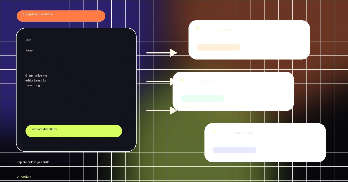
Most AI-built apps do not fail because the model cannot write code. They fail earlier, when the builder starts with a blank prompt and asks the agent to invent product taste, visual hierarchy, copy, component structure, and implementation at the same time.
That is a lot to ask from one prompt. I felt it again while building Prose, a Grammarly-style mobile editor tuned for how I actually write. The app is React Native and NativeWind, but the important step happened before the code: I used v-1.design to explore the visual direction first, picked the one that felt right, and then built the app around that direction.
Key Takeaways
- Start AI app builds by exploring several design directions, not by asking for one generic first screen.
- A good design direction gives the coding agent product context: layout, hierarchy, tone, component states, tokens, and examples.
- The explore step is especially useful for solo builders because it makes taste decisions early, before implementation gets expensive.
- For mobile apps, the workflow should include real states: onboarding, editor, empty states, paywall, settings, and error handling.
- v-1.design works best as the design-context layer before tools like Cursor, Claude Code, Codex, Lovable, Bolt, or v0 start building.
The blank prompt problem
The default AI app workflow is still too vague.
You open a builder or coding agent and type something like: "Build a Grammarly app for mobile." The agent does what it can. It creates screens, picks colors, writes placeholder copy, invents spacing, chooses generic cards, and ships something that technically exists.
But it usually feels like a template.
The problem is not that AI tools are useless for UI. The problem is that the prompt gives them no taste. It gives them a product category, but not a design point of view. So the agent fills the gap with the safest average it has seen before: rounded cards, soft gradients, generic SaaS copy, and a layout that could belong to any app.
That might be fine for a throwaway prototype. It is not enough if you want the MVP to feel like a product people can trust.
What a design direction actually decides
A design direction is not just a moodboard. It is a set of constraints the agent can build inside.
A useful direction decides how the product should feel, how dense the interface should be, what kind of typography fits the job, how much contrast the app needs, what components repeat, and which screens matter first.
Visual language
For Prose, the app needed to feel calm and focused. A writing tool cannot look like a crypto dashboard. It also cannot be so plain that it feels unfinished. The direction needed warmth, space, and just enough structure to make editing feel safe.
That kind of decision is hard to recover after the app is built. If you wait until the end, you are not polishing. You are redesigning.
Product behavior
The direction also affects behavior. A writing assistant needs suggestions, scores, tone feedback, templates, premium nudges, and rewrite actions. Those are not random UI blocks. They are product moments.
If the direction ignores those moments, the agent will build screens instead of a workflow.
How I used this on Prose
While marketing v-1.design, I used it on my next app instead of treating it like a separate product.
Prose is a Grammarly-style editor, but tuned for how I actually write. The build includes grammar fixes, clarity feedback, tone rewrites, templates, a writing score, and a premium flow. It is not just a landing page. It is a functional mobile app built with React Native and NativeWind.
The useful part was not that v-1.design magically wrote the whole app. The useful part was that it helped me avoid starting from nothing.
I explored a few directions, looked at how each one framed the writing experience, chose the one that matched the product, and then used that as the source of truth for the implementation. That made the build feel more like executing a direction and less like arguing with an agent about taste screen by screen.
The explore-first workflow
This is the workflow I now want for every new project:
- Write the product idea in plain English.
- Generate multiple visual directions.
- Compare them before committing.
- Pick the direction that matches the user, category, and business model.
- Give the agent the chosen direction as context.
- Build the MVP from that context.
That one extra step changes the quality of the build.
Instead of asking the agent to invent everything, you make the taste decision first. Then the agent can focus on implementation.
Why this matters for speed
It sounds slower, but it is faster in practice.
The slow part of AI app building is not typing prompts. The slow part is the loop where the first version looks wrong, the next version looks different but still wrong, and eventually the product becomes a messy compromise of half-accepted iterations.
Exploring directions up front reduces that loop. You make the visual decision before the codebase hardens around a weak first draft.
What to hand to the agent
A good AI app design workflow should give the agent more than a screenshot.
At minimum, hand it:
- the product goal and target user
- the selected visual direction
- the design style and tone
- screen list and route structure
- component hierarchy
- color, spacing, and typography tokens
- real product copy examples
- empty, loading, success, and error states
- acceptance criteria for what "done" means
This is where a library like v-1.design is useful. The library is not only inspiration. It is a way to turn finished design examples into implementation context for AI builders.
If you are building with tools like Lovable, Bolt, v0, Cursor, Claude Code, or Codex, that context matters. The stronger the direction, the less the agent has to guess.
Common mistakes
Mistake 1: treating the first output as the design
The first output is usually a guess. Do not confuse speed with direction. Generate options before you emotionally attach to the first one.
Mistake 2: optimizing one screen instead of the workflow
A pretty homepage is not a product. For Prose, the editor, suggestion flow, templates, score screen, and premium flow mattered more than one hero screen.
For your app, identify the screens that carry the product promise. Build the direction around those.
Mistake 3: asking the agent to fix taste with more adjectives
"Make it premium" is not enough. "Make it less generic" is not enough. The agent needs constraints, examples, and product-specific structure.
Better prompts describe how the interface should behave, what the user is trying to accomplish, and what the product should avoid.
Mistake 4: skipping mobile reality
Mobile apps need state. They need tight hierarchy, comfortable touch targets, focused flows, and real edge cases. If you only explore desktop-style mockups, the implementation will drift when you move into React Native.
That is why I care about app examples, not just web landing pages.
A practical prompt structure
If you want to try this workflow without a library, use this structure:
I am building [product] for [target user].
The core workflow is [main action].
Explore 3 distinct visual directions before building.
For each direction, define:
- visual style
- typography and spacing
- primary screens
- component system
- empty/loading/error states
- why this direction fits the user
After that, recommend one direction and explain the tradeoff.
This is better than a blank prompt because it forces the agent to separate taste from implementation.
But the better version is using a real design source. That is why v-1.design exists: finished examples, prompts, recipes, styles, and build context that help the agent start from a direction instead of a void.
Explore before you build
The biggest shift is simple: do not start by building. Start by choosing.
Choose the visual direction. Choose the product tone. Choose which screens matter. Choose the constraints. Then let the agent build inside that frame.
That is how I built Prose while marketing v-1.design, and it made the product feel more coherent from the start.
For me, this is the new MVP loop:
idea → explore directions → choose one → build → ship
If you are tired of AI-built apps looking generic, the fix is not only a better coding model. The fix is better context before the first line of code.
FAQ
What does it mean to explore design directions?
Exploring design directions means generating and comparing multiple visual approaches before committing to implementation. Each direction should include style, layout, components, screen priorities, copy tone, and product states.
Is this only useful for designers?
No. It is especially useful for founders and developers because it gives them a clearer design source before handing work to an AI builder or coding agent.
Can I use this workflow with React Native?
Yes. Prose was built with React Native and NativeWind. The same workflow applies: choose the mobile design direction first, then map it into screens, components, and states.
How does v-1.design fit into the workflow?
v-1.design gives you finished app and website design examples with prompts and implementation context. You use it before building so the agent starts with a concrete direction instead of inventing the UI from a blank prompt.
What should I do after choosing a direction?
Turn the direction into build context: routes, screen list, component structure, tokens, copy examples, and acceptance criteria. Then give that packet to your AI builder or coding agent.
Start from a direction, not a blank prompt
Browse the v-1.design library to find app and website directions before you build. If you want the implementation path, read Library to app. For the broader problem, see why AI-built apps look the same and AI app design examples.