AI Design Prompts: A Framework, Template, and 3 Examples
Stop prompting with adjectives. Learn the seven-decision framework for AI design prompts, then copy one practical template and three complete examples.
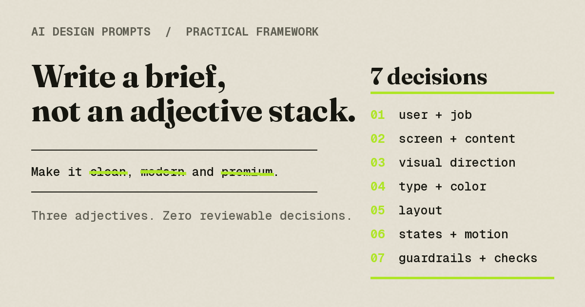
Here is the blunt version: AI design prompts are more useful when they make reviewable decisions instead of relying on adjective stacks. "Clean, modern, premium" names a mood and settles nothing — not the typeface, not the palette, not the density, not what the screen shows when a table is empty. Whatever remains open may be filled by a tool's defaults, which can create familiar patterns.
A practical alternative is a compact design brief: seven named decisions the model can follow and you can review. This guide gives you that framework, one copyable master template, three complete examples, an iteration pattern that fixes one decision without restyling everything, and notes on carrying the same brief into different tools.
Key Takeaways
- A working AI design prompt is a compact design brief: user and job, screen and real content, visual direction, type and color tokens, layout, component states, and guardrails.
- Adjectives contribute mood, but they don't replace decisions. "Editorial" starts to mean something once it's anchored to named fonts, hex values, and a reference.
- Using real content can expose hierarchy problems that placeholder copy may hide; Lovable explicitly recommends designing with real content.
- Guardrails ("no card grid, no purple gradient") plus acceptance checks ("14 rows visible at 1440px") make output reviewable, not just judgeable.
- Iterate one decision at a time, and say explicitly what must not change.
- The seven-decision checklist is tool-agnostic and can be adapted for v0, Lovable, Bolt, Replit, Cursor, Claude Code, and Codex. The syntax, defaults, and behavior of each tool still differ.
Why "clean, modern, premium" under-delivers
When a founder on r/vibecoding asked what prompts people use to make AI-generated design "cool and professional," several replies pushed in one direction: away from adjectives, toward named styles, palettes, shapes, and corner radii — because "cool" and "professional" carry almost no shared meaning (r/vibecoding discussion). A Cursor thread about premium SaaS UI collected the symptoms of leaving those gaps open: cramped layouts, too many cards, default Tailwind styling, generic icons, weak hierarchy, inconsistent spacing (r/cursor discussion). And detail alone doesn't rescue you if it's the wrong kind of detail: one Wix user described answering the builder's business questionnaire at length and getting a site that barely reflected any of it beyond headline copy (r/WIX discussion). These are anecdotes, not benchmarks — but they describe the same shape of failure: asking for taste while leaving every taste decision open.
Model vendors describe the same problem from the other side. Anthropic's prompting guidance warns that Claude models without concrete steering can converge on generic frontend patterns, and recommends structured, relevant examples as a reliable way to steer Claude's output.
None of this means adjectives are useless. "Editorial," "brutalist," "warm" are fine words for setting a mood — the rest of the prompt just has to cash them out in fonts, colors, and layout. An adjective is a direction; a decision is a destination. If your builds already have that interchangeable AI look and you want the full diagnosis, we've written it up separately in why AI-built apps look the same. This guide is the prescription.
The seven decisions
OpenAI's frontend prompting guide makes the core point plainly: tailor layout, components, style, copy, and interactions to the audience and domain rather than accepting generic visual defaults. In practice, that means settling seven things before you hit enter.
1. User and job
Who looks at this screen, and what do they need to get done? "A dashboard for my app" gives the model nothing. "A Monday-morning triage screen for customer-success managers deciding which accounts to call first" implies density, sorting, and restraint before you've named a single color.
2. Screen and real content
Pick one screen and write its actual content into the prompt: real labels, plausible numbers, headline copy you'd ship. Lovable's prompting guide recommends planning first, using real content, and building by component rather than describing a whole app at once. Lorem ipsum reads as neutral filler; real content helps expose hierarchy problems.
3. Visual thesis and reference
One sentence of direction plus a reference you and the model both understand: "editorial utility, closer to a sports magazine than a SaaS template," or "the density of a trading terminal." This is where adjectives earn their keep — anchored to a reference, they stop being vibes.
4. Type and color tokens
Name fonts, sizes, and hex values, and give each a usage rule. "Inter for UI, IBM Plex Mono for numerals; background #FAFAF7, ink #1C1B18, accent #C4402F reserved for risk states." The rule matters as much as the value: an accent without a rule ends up everywhere.
5. Layout and composition
Say what dominates the viewport and how the page divides: "the table is the hero, full width; filters in a 220px left rail; no cards above the fold." Grid, density, and asymmetry are decisions the model will otherwise make for you — for example, as three centered cards.
6. Components, states, and motion
List the components, then the unglamorous states — empty, loading, error, hover — with real copy for each. Add one motion rule, even if the rule is "none." Screens fall apart in the states nobody prompted for.
7. Guardrails and acceptance checks
Exclusions tell the model what not to reach for: "no KPI card grid, no purple gradients, no radius over 8px." Acceptance checks tell you how to review: "at 1440px I can see at least 14 rows." A prompt is specific enough when a colleague could disagree with it.
The master template
OpenAI's prompt engineering guide recommends separating instructions, context, and examples cleanly and — for frontend work — specifying typography, color, spacing, interaction states, and accessibility explicitly. This template packs the seven decisions into one block you can paste into a chat-style tool:
Build [screen] for [product], a [one-line product description].

USER & JOB: [who] uses this screen to [job]. Optimize for [what matters most].

CONTENT (use exactly this; no lorem ipsum):
- [real heading, labels, table columns, numbers, button copy]

DIRECTION: [one-sentence visual thesis]. Reference: [named style, product, or genre].
Not: [what it should not resemble].

TYPE: [display font] for [use]; [body font] for [use]. Base size [n]px.
COLOR: background [hex], text [hex], accent [hex]. The accent is only for [rule].

LAYOUT: [grid / rails / columns], [density rule], [what dominates the viewport].

COMPONENTS & STATES: [list]. Include empty, loading, error, and hover states.
Empty state copy: "[real copy]". Motion: [one rule, or "none"].

ACCESSIBILITY & RESPONSIVE: [keyboard and focus behavior], [contrast requirement],
[reduced-motion behavior], [semantic labels], and [mobile layout rule].

AVOID: [3–6 concrete exclusions].

ACCEPTANCE: when done, I will check that [2–3 verifiable checks].
Replace every bracket with a decision. Any bracket you can't fill is a decision you haven't made yet — and the model will happily make it for you.
Three complete examples
Three briefs, three genres. Each will render differently in different tools, and differently across runs in the same tool — that's expected. The point is that every line is reviewable. If you want visual inspiration rather than prompt construction, browse our AI app design examples.
Example 1: SaaS dashboard
Build the "Accounts at risk" screen for Renewal, a customer-success tool for B2B SaaS teams.

USER & JOB: CS managers at 50–500-person companies open this on Monday morning to decide
which accounts to call this week. Optimize for scanning many rows fast.

CONTENT (use exactly this; no lorem ipsum):
- Page title: "At risk this quarter" with a count badge "23"
- Table columns: Account, ARR, Renewal date, Health, Last touch, Owner
- Sample rows: "Northwind Traders — $86,400 — Oct 14 — At risk — 21 days ago — Priya";
  "Acme Fabrication — $42,000 — Nov 2 — Watch — 6 days ago — Tomás"
- Row action: "Log call"

DIRECTION: dense operational table, closer to a trading terminal than a marketing site.
Not: a KPI-card dashboard.

TYPE: Inter for UI text; IBM Plex Mono for ARR figures and dates. Base size 13px.
COLOR: background #FAFAF7, text #1C1B18, borders #E4E1DA. Accent #C4402F only for
"At risk" status and overdue dates; "Watch" is #8A6D1F. No other color.

LAYOUT: the table is the hero and spans full width; filters (segment, owner, renewal
window) in a 220px left rail; one slim text summary strip above the table — not cards.

COMPONENTS & STATES: sortable headers; row hover #F1EEE7; skeleton rows while loading;
error banner with retry. Empty state copy: "No accounts match these filters. Clear
filters or widen the renewal window."

ACCESSIBILITY & RESPONSIVE: sortable headers expose sort state; every row action is keyboard
reachable with a visible focus ring; status is conveyed by text as well as color; below 768px,
keep account name and health visible while secondary columns move into a row detail view.

AVOID: KPI card grids, donut charts, purple gradients, drop shadows, icons inside table
cells, corner radius over 6px.

ACCEPTANCE: at 1440px I can see at least 14 rows without scrolling; ARR figures align;
the only red on the page marks risk.
Several complaints from that Cursor thread — including card overload and weak hierarchy — reappear here as explicit exclusions or checks.
Example 2: Consumer mobile app
Build the home screen for Ember, a mobile journaling app used in bed, at night, in the dark.

USER & JOB: people winding down before sleep who want to write for two minutes without
being stimulated back awake. Optimize for calm and one-handed use.

CONTENT (use exactly this; no lorem ipsum):
- Greeting: "Tuesday, late."
- Prompt of the day: "What did you almost say out loud today?"
- Primary action: "Write"; secondary: "Read something old"
- Streak line: "14 quiet nights" — understated, not gamified

DIRECTION: a paper notebook read by lamplight; closer to a reading app than a social app.

TYPE: Newsreader (serif) for the prompt and entries; the system sans at 15px for controls.
COLOR: background #16130F, text #F0E7D8, accent #E5623D only on the "Write" button and
the text cursor. Nothing pure white, nothing blue.

LAYOUT: single column; line height 1.6; the day's prompt owns the top third; "Write" is
a full-width bar anchored in the bottom thumb zone.

COMPONENTS & STATES: composer sheet slides up over the home screen; first-run empty state
copy: "Nothing here yet. That's the point of tonight."; offline banner: "Saved on your
phone. Will sync later." Motion: 200ms fades only — no bounces, no confetti.

ACCESSIBILITY & RESPONSIVE: maintain 4.5:1 text contrast; support system text scaling without
clipping; label icon-only controls; keep a visible focus state for external-keyboard navigation;
honor reduced-motion by removing the composer transition.

AVOID: badges, streak flames, bright blue links, card grids, five-item tab bars,
red notification dots.

ACCEPTANCE: in a dark room the brightest element is the text being written; every control
in the bottom half is thumb-reachable; nothing on screen celebrates at me.
Example 3: Landing page
Build a single landing page for Blockhour, a scheduling tool for independent fitness
coaches who fill their week with one-on-one client sessions.

USER & JOB: a coach with 25–40 sessions a week decides in 30 seconds whether this
replaces their spreadsheet. Optimize for "built for my job," not general polish.

CONTENT (use exactly this; no lorem ipsum):
- H1: "Your week, fully booked, still yours."
- Subhead: "Blockhour fills cancellations from your waitlist and keeps your calendar honest."
- Primary CTA: "Start with your real week"; secondary: "See a coach's Tuesday"
- Three proof sections — waitlist autofill, no-show rules, payout summary — one sentence
  of body copy each, no feature grid
- Footer line: "Made for coaches who train people, not spreadsheets."

DIRECTION: editorial utility, closer to a sports magazine spread than a SaaS template.

TYPE: Fraunces for headlines (72px hero, tight leading); Geist Mono for schedule numerals
and labels; a neutral sans at 17px for body.
COLOR: paper #F6F4EE, ink #141414, acid green #C8F135 only on the primary CTA and one
underline in the H1.

LAYOUT: asymmetric hero — headline takes the left 7 of 12 columns; the right 5 show a
dense, realistic Tuesday schedule (6:00–19:00, client names, one cancellation being
backfilled). Sections alternate alignment; no centered feature grid.

COMPONENTS & STATES: sticky header after 600px of scroll; the schedule graphic animates
once — a cancelled 7:00 slot refilling from the waitlist, 400ms; CTA hover darkens the
green, no lift, no glow.

ACCESSIBILITY & RESPONSIVE: preserve heading order and landmarks; use visible keyboard focus;
maintain 4.5:1 contrast for body copy and controls; replace the schedule animation with its final
state under reduced motion; stack the hero into one column below 768px without hiding the schedule.

AVOID: three-card feature rows, purple-to-blue gradients, corner radius over 8px,
testimonial carousels, floating phone mockups, emoji in headings.

ACCEPTANCE: a stranger can say who the product is for from the hero alone; the schedule
shows real names and times; acid green appears in exactly two places.
Note what the acceptance line does in each brief: it converts "make it good" into something you can check in ten seconds.
How to iterate without restyling everything
One failure practitioners report after a first render is that fixing one thing can quietly restyle several others. Participants comparing prompt-to-UI tools in a UX design thread described, anecdotally, long iteration loops and output drifting away from their design systems. The countermeasure below is a recommended discipline, not a guaranteed tool behavior:
- Review against your acceptance checks, not against vibes.
- Name the one decision that failed — layout density, accent usage, type scale.
- Send a scoped edit that restates that decision precisely and pins everything else.
Lovable's prompting guide teaches the same edit discipline — be precise about what changes and what stays. A scoped edit looks like this:
The table is too airy: only 8 rows are visible at 1440px.
CHANGE: row height to 40px, base font to 13px, remove vertical padding on the summary strip.
DO NOT CHANGE: fonts, colors, the filter rail, column order, or any copy.
Our recommended workflow is one decision per iteration. If two decisions are wrong, consider two prompts: combining “fix the density” with “warm up the palette” can invite broader changes than you intended.
Handoff notes for specific tools
The seven decisions are tool-agnostic; the tools are not interchangeable. Each accepts a brief differently, with its own syntax and defaults. If you're still choosing what to build with, our builder workflow comparison covers that decision, and our AI builder profiles track the individual tools.
- v0. The v0 docs describe generating high-fidelity UI from wireframes or mockups, with prompt-driven refinement. If you have a reference image, attach it alongside the written brief instead of describing it from memory.
- Lovable. Lovable's design guidance states that open-ended requests can trigger up to three exploratory design directions, while detailed prompts specifying fonts, colors, references, or a named design system can skip that step. A completed master template is exactly that kind of prompt. For patterns tuned to this builder, see our Lovable design prompts guide.
- Bolt and Replit. Treat this as an untested starting heuristic rather than documented product behavior: put the brief in your first message, then restate the relevant guardrails when requesting structural changes. Review the result against the same acceptance checks you would use elsewhere.
- Cursor. Cursor's agent best practices recommend planning before coding, giving the agent concrete goals, and using screenshots for design-to-code work and visual debugging. In a repo, you can encode decisions 4 through 7 in a tokens file and a reference component that supplements the written brief.
- Claude Code and Codex. As house advice—not verified product-specific guidance—give each agent the same written acceptance criteria, existing design tokens, and reference screenshots, then require it to report visual gaps after running the project checks.
The brief is portable. Expectations of identical output are not.
Where v-1.design fits
Decisions 3 through 5 — thesis, tokens, layout — can be difficult for non-designers because they require taste you may not have stocked yet. That's the gap v-1.design fills. It isn't another app builder and it doesn't write your application code; it's a design source. You pick a finished reference design, and it ships as a rebuild package with four parts — live demo, design system, assets, and rebuild prompts — with the literal font, color, and spacing values already filled in (how the handoff works). Your builder of choice does the building; the package supplies the decisions, and the live demo gives you something concrete to compare the result against.
Methodology
This guide draws on first-party documentation from Lovable, OpenAI, Anthropic, v0, and Cursor, plus qualitative community discussions, all reviewed on July 16, 2026. Community threads are cited as audience language — how people describe the problem — not as evidence of any tool's performance. We did not run a standardized hands-on benchmark across tools, and no prompt in this guide guarantees a particular output.
FAQ
How long should an AI design prompt be?
Long enough to cover the seven decisions and no longer. The complete examples in this guide run to a few hundred words because they include real content, states, accessibility, and acceptance checks. Length isn't the goal — a long stack of adjectives can still decide nothing. The better test: every line should be something a colleague could disagree with.
Do adjectives like "clean" and "modern" belong in AI design prompts?
They can contribute mood, but they don't replace decisions. On their own, words like "clean" leave typeface, palette, density, and hierarchy to the model's defaults. Anchor them instead: pair "editorial" with named fonts, hex values, and a reference the model can act on.
Can I reuse the same design prompt across different AI tools?
The decisions transfer; the delivery doesn't. Tools accept input differently — some take reference images, some propose design directions, some work inside your repo — and the same brief may render differently in each or across runs. Keep the brief as your source of truth and adapt the packaging per tool.
Should I include exact fonts and hex codes, or is that overkill?
Include them when you have them. Specific values turn review into verification: "that's not #C4402F" is checkable, "that red seems off" is a mood. Lovable's documentation, for one, notes that prompts specifying fonts, colors, and references can skip its exploratory design step — those details may let you move directly into building.
What if I don't know what I want the design to look like yet?
Prompting cannot specify visual choices that have not been made yet. Start from a real interface you admire and extract its type, palette, and layout — or start from a finished reference design that already ships with tokens and prompts. Editing an existing set of decisions can be easier than defining a design system from scratch.
Start from decisions, not a blank page
Everything in this guide works from zero: seven decisions, one template, scoped iterations. But nothing requires you to invent those decisions from scratch. Every design in the v-1.design Library is a finished reference you can inspect before you commit — live demo, design system, assets, and rebuild prompts with the literal values filled in. Browse it the way you'd browse a bookshelf: find the one whose decisions you'd defend, and start your next prompt already ahead.